





Chocolate, Burgundy and Butter: The Colours Designers Are Choosing Now
Every few years, the colours designers reach for change temperature. After a decade of greige and cool white, the palette has gone warm again, and it has gone somewhere you can almost taste: chocolate, burgundy, butter. They are colours of a long dinner, a good library and late afternoon sun. And they work beautifully together.
The short answer: The colours designers are choosing now are chocolate brown, burgundy and butter yellow. In the 1stDibs 2026 Interior Designer Trends survey, 33% of designers chose chocolate brown as the colour of the year and 21% chose burgundy, up from 7% the year before. Use brown on soft, rounded upholstery, burgundy on walls, velvet or stone, and butter yellow as the accent that lifts them both.
What the designers said
Each year 1stDibs surveys interior designers about what they are specifying next. For 2026, 468 designers answered, and the results confirm what we have been seeing in our own projects in New York:
- Chocolate brown was named colour of the year by 33% of designers, almost double the 17% who said so in 2022.
- Burgundy jumped to 21%, from 7% for 2025.
- Butter yellow was the pick of 30% of designers for 2025, up from 14% the year before.
- Maximalism (39%) and eclecticism (38%) led the styles, and 43% of designers said they are drawn to curvy furniture.
In other words: warmer colours, softer shapes, and rooms with more personality. Here is how we use each of the three.
Chocolate: the new neutral
Brown has quietly replaced grey as the colour designers build a room on. It is warmer, it flatters skin and wood, and it changes through the day, from milk chocolate in the morning to espresso by lamplight. The trick is to put it on something you want to touch.

In this library, a pair of Malibu Armchairs in brown bouclé turns a panelled room into somewhere to stay all evening. The Malibu is an homage to mid-century design and organic architecture: strong curves, unusual proportions and contrasting piping that traces the arms and base. A green rug and a hint of rust keep the brown from feeling heavy.

Brown also loves blue. The Malibu Sofa, the straight counterpart to the Malibu curve, sits here in cognac against a blue wall with coral accents. Its velvet piping is applied by hand and its seat sits on an eight-way hand-tied spring system, so the shape lasts as long as the colour.
Burgundy: the colour of the evening
If chocolate is the new neutral, burgundy is the new statement. It is deeper and more grown-up than red, and it has the rare quality of looking expensive in any material: paint, velvet, marble, glass.

The boldest way to use it is to drench a room: walls, curtains and floor in one deep wine tone. What makes this room work is the single pale line of the On The Rocks Console Table: a hand-hammered travertine top on a sleek nickel base, 70 inches long and only 17 deep. Against burgundy, raw stone glows.

For a quieter dose, bring burgundy in through stone. The L’anamour Coffee and Side Tables can pair a red travertine side table top with an olive ash coffee table, two pieces that complete each other, as the name suggests, like poet and muse.

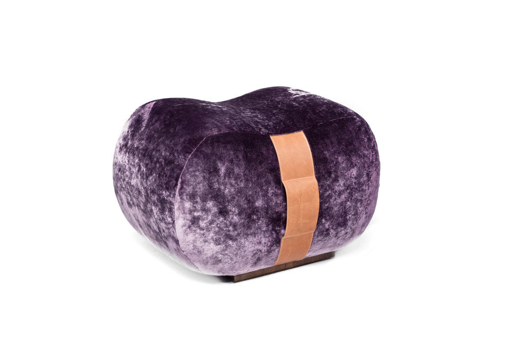
Or put it at the threshold. In this hallway, the La Folie Ottoman, upholstered in velvet and finished with silk fringes, sits beside a woven rattan console. Burgundy and rattan are one of our favourite pairings: rich and relaxed at once.

The smallest way to try it: the Trip 2 Table Lamp in burgundy marble with a hand-painted, mouth-blown opal shade. It is cordless, dims at a touch and runs up to 14 hours on a charge, so it can move from the console to the dinner table.
Butter: the light that lifts it all
A room of brown and burgundy needs sun. Butter yellow, and its deeper cousins mustard and ochre, is the colour that keeps a warm palette from turning heavy. Use it in doses: a chair, a backrest, a bunch of flowers.

The Casablanca Chair in a brown-toned frame against yellow drapery is the palette in one image. It is designed for long dinners, with a soft backrest that matches the seat, and both the frame colour and the upholstery can be customised.

The Horizon Sofa plays with yellow in a clever way: its loose circular backrest rolls from one side to the other and takes two opposing fabrics, so you can show the mustard side in winter and something calmer in summer.

At the table, a Camelia Dining Chair in a mustard bouclé brings the colour to eye level. Its arched back and plush seat are made for long dinners, and its textured upholstery catches the light the way butter yellow should.

And the easiest dose of all: flowers. On the L’anamour Dining Table, a round marquetry top of olive ash on a sculpted travertine base, a bunch of mimosa is all the yellow the room needs.

For the maximalists, and 39% of designers say that is the direction, go further: butter yellow chairs, pink art and a row of coloured glass on the Go Sideboard, whose doors are lacquered in the colour of your choice.
Putting the three together
In Feng Shui, brown and yellow belong to Earth, the element of stability and nourishment, and burgundy belongs to Fire, the element of warmth and gathering. Earth and Fire support each other, which is why these three colours feel so good in a living or dining room. Our rule of thumb:
- Chocolate for the big, soft pieces: a sofa, a pair of armchairs, a rug.
- Burgundy for one dramatic surface: a wall, a curtain, a stone top or a velvet ottoman.
- Butter for the accents: a chair, a backrest, flowers, a lamp.
- One pale material (travertine, opal glass, ivory linen) so the eye can rest.
Frequently asked questions
What are the interior design colour trends for 2026?
Warm, deep and food-inspired colours lead. In the 1stDibs 2026 Interior Designer Trends survey of 468 designers, 33% named chocolate brown as the colour of the year, up from 17% in 2022, and burgundy rose to 21% from 7% the year before. Butter yellow, named by 30% of designers for 2025, remains the soft counterpart.
How do you decorate with chocolate brown without making a room dark?
Use it on something soft and rounded, such as a bouclé armchair or a velvet sofa, and keep the walls lighter, or warm the brown with green, blue or rust around it. Brown reads rich when it has texture and light around it.
What colours go with burgundy in a living room?
Burgundy pairs well with travertine and warm stone, rattan, natural wood, blush pink, ochre and deep green. Use it as a wall colour, a velvet piece or a stone accent, and let one pale material keep it fresh.
Is butter yellow still in style?
Yes, as an accent rather than a whole room: a mustard bouclé chair, a yellow backrest or a bunch of mimosa on a dining table. It lifts browns and burgundies and keeps a warm palette from feeling heavy.
What does Feng Shui say about brown, red and yellow?
Brown and yellow carry Earth energy, which is grounding and nurturing, ideal for living and dining rooms. Red and burgundy carry Fire, the energy of warmth, passion and gathering. Together they make a room that feels stable and welcoming; balance them with a little Metal (stone, brass) or Water (blue, glass).
Can I order these pieces in my own colours?
Most of our upholstered pieces are made to order in your choice of fabric and finish, typically shipping in 10 to 12 weeks. Ordered now, they arrive for spring.
For more on warm, low-lit rooms, read After Dark: how to design a moody room that still feels warm, and for the stone that ties these colours together, Travertine at Home.
Survey figures: 1stDibs 2026 Interior Designer Trends survey of 468 interior design professionals, published November 2025.
Written by Marie Burgos, founder of Maison Burgos and of Marie Burgos Design, the New York interior design studio she established in 2007. Marie is an NYU-trained interior designer and Feng Shui Master. She founded Maison Burgos in 2018: a collection of furniture, lighting and objects curated by Marie, including pieces of her own design, brought to life with the craftsmen and artisans she works with.

Written by Marie Burgos


